Introduction and Use Case:
So you’re a new kid on the SOC and Accounting is freaking out about a massive unexpected increase in their Sentinel ingest cost (or a sudden decrease, both are covered in detail) - and demanding an explanation. This is a step-by-step guide to leveraging KQL for investigating unexplained dips and spikes in ingest volume and uncovering the when/what/why. Put on your detective hat.
Where to start?
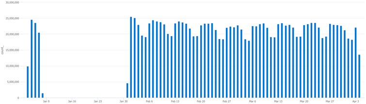
As mentioned, all you know is that there are significant discrepancies in cost over the past quarter (90 days). Let’s look at the ingest pattern over the past quarter and graph billable volume via the usage table with the following query for a birds-eye view of what’s going on in the environment:
Usage
| where TimeGenerated > ago(90d)
| where IsBillable == true
| summarize TotalVolumeGB = sum(Quantity) / 1000 by bin(StartTime, 1d), Solution
| render columnchart
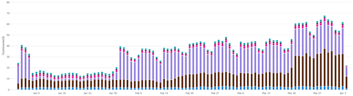
Hover over the colour coded lines to see what they represent. In this case, purple represents LogManagement and the darker colour represents Security log tables, illustrated here:
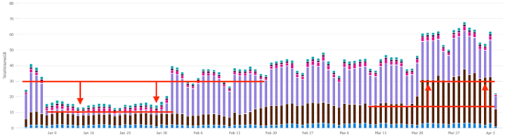
Take note of any unusual spikes or valleys in ingest. The first thing you should notice is the drop off for ingest volume in January. Next is the sudden increase in ingest volume towards the end of March. In the below screenshot, ingest volume from the LogManagement tables almost completely disappeared in January, and the Security tables grew significantly in March.
What happened to LogManagement ingest volume in January?
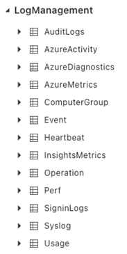
The LogManagement tables can be viewed in the UI from the Sentinel workspace, simply expand the LogManagement drop-down to see them, shown below:
Something in one or more of these tables within the LogManagement solution has changed and is responsible for the drop in ingest volume.
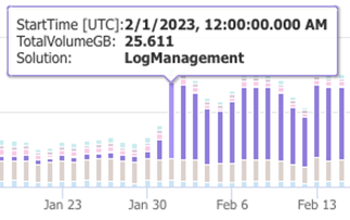
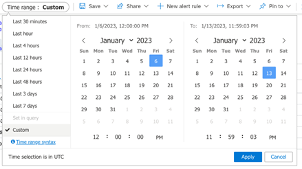
To find out, we can graph the usage for each solution across the specified time frame. Set the custom time frame as illustrated in the below screenshot that corresponds with the sudden change:
To determine which of these tables dropped off during that time, we can run the following queries which will hit each table from the LogManagment solution and graph their ingest volume.
AzureDiagnostics
| summarize count() by bin(TimeGenerated,1d)
| render columnchart
…
AzureActivity
| summarize count() by bin(TimeGenerated,1d)
| render columnchart
…
AuditLogs
| summarize count() by bin(TimeGenerated,1d)
| render columnchart
… … … … …
None of the above correlate or explain what happened. However, the next one, syslog, yielded results:
Syslog
| summarize count() by bin(TimeGenerated,1d)
| render columnchart
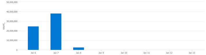
Here we can see that the syslog table is responsible for the LogManagment drop off noted earlier on. The next question you should be asking yourself is “where are these coming from/what computers are contributing to syslog volume?” Lets further define the “What” part of this equation.
This next query will return which computers are generating syslog data:
Syslog
| summarize count() by Computer
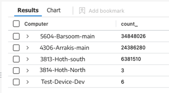
Note the 3 most verbose machines listed. Running the following query against each machine will tell us if this drop off in ingestion can be wholly or partially attributed to them.
In this next step we plugin the top 3 machines from the previous query to confirm:
Syslog
| where TimeGenerated > ago(90d)
| where Computer == "5604-Barsoom-main"
| summarize count() by bin(TimeGenerated,1d)
This confirms which machines were responsible for the drop off. Take note of these devices and check with the team(s) responsible for their management and maintenance, they’ll want to know.
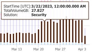
In my next post, we will explore the sudden increase in billable ingest volume coming from the Security source/solution.
Summary:
In this post, we:
- Graphed the last 90 days of billable ingest cost
- Identified a sudden drop off of billable ingest volume
- Identified the Logging Solution (LogManagement)
- Identified the specific Table
- Tracked down the specific device
📚 Want to go deeper?
My Toolbox books turn real Microsoft security telemetry into defensible operations:

🧰 PowerShell Toolbox Hands-On Automation for Auditing and Defense
🛠️ KQL Toolbox: Turning Logs into Decisions in Microsoft Sentinel
📖 Ultimate Microsoft XDR for Full Spectrum Cyber Defense
Real-world detections, Sentinel, Defender XDR, and Entra ID — end to end.